


Prussian Blue Cone Ink Bottle
| Categories | Ink Bottle |
| Material | Glass |
| Markings | Unmarked |
| Manufacturer | Undetermined |
| Origin | United States |
| Date or Era | circa 1880 |
| Measuring | 2 ⅝” high |
This Prussian blue cone ink bottle is a striking example of 19th-century utilitarian glassware, elevated by its exceptionally rare color. While “cone inks” were common in the mid-to-late 1800s, they were typically produced in aqua or amber; this deep, saturated blue is a highly sought-after variation among collectors.
Physical Characteristics and Form
- Body Shape: The bottle features a classic conical form, with a wide, stable base that tapers upward to a narrow neck. This design was specifically engineered to prevent tipping during use.
- Color: The glass is a dense Prussian blue. In reflective light, it appears almost midnight-blue, but when backlit, it reveals a vibrant, translucent teal-blue quality with visible seed bubbles and striations characteristic of period glass.
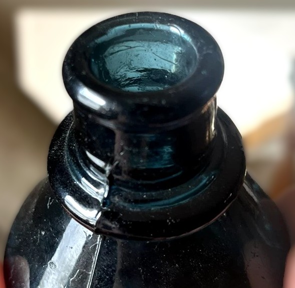
- Neck and Lip: The neck is accented by a pronounced, heavy ring (or collar) just below the finish. The lip is tooled, showing the slightly irregular, rounded edges created by a glassmaker using a hand-held finishing tool rather than a machine-formed mold.
Manufacturing Details
- Hand-Blown Construction: The bottle shows clear signs of being hand-blown into a mold. Visible vertical mold seams run up the sides of the body but stop short of the tooled lip, indicating the neck and finish were completed by hand after the bottle was removed from the mold.
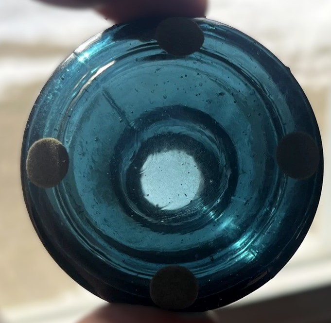
- The Base: The underside shows a smooth, slightly concave profile with a faint circular indentation, consistent with a blown-in-mold process. The small felt pads currently attached are modern additions to protect the glass.
- Glass Texture: The surface contains “whittling” and small bubbles (seeds), which provide the glass with an organic, handmade texture that modern reproductions cannot easily replicate.
The deep Prussian blue of this cone ink bottle is a rarity. In the 19th century, while aqua and amber glass were the standard for utilitarian items, specific glasshouses in the Eastern United States became renowned for their experimentation with vibrant, high-quality colored glass for the stationery trade.
Research into 19th-century glass production points to several key regions and glasshouses likely responsible for such a high-end variation:
- The South Jersey Glasshouses (New Jersey)
New Jersey was the epicenter of American glassmaking during the mid-to-late 1800s. Several glasshouses here were famous for their “South Jersey style”—characterized by heavy, hand-blown forms and a mastery of color.
- Isabella Glass Works: Known for producing bottles for major ink manufacturers like Harrison’s Columbian Ink. While Harrison bottles are often multi-sided, Isabella Glass Works was a primary supplier for high-quality ink containers in rare blue and teal variations.
- Whitney Glass Works (Glassboro, NJ): One of the largest producers of specialized bottles, they frequently produced proprietary shapes and colors for commercial ink firms.
- The Pennsylvania Glasshouses
Since many major ink manufacturers (like Carter’s and Sanford’s) were headquartered in the Northeast, they often sourced their glass from nearby Pennsylvania firms.
- Dyottville Glass Works (Philadelphia): A major producer of 19th-century utility bottles. They were known for their heavy, durable glass and produced numerous “umbrella” and “cone” styles. Finding a cone ink in Prussian blue from this region would be consistent with the high-end office supplies marketed to Philadelphia’s business elite.
- European Influences (British Glasshouses)
Given the “Prussian blue” nomenclature—a pigment famously associated with European chemistry—it is also possible the bottle originated from a British firm like P. & J. Arnold or Stephens’ Ink.
- These companies often exported “Master Inks” and individual desktop bottles to the U.S.
- British glassmakers at Stourbridge or Newcastle were pioneers in adding cobalt and other metal oxides to create the deep, saturated blues.
Identifying Markers
- The Ring/Collar: The heavy, tooled ring around the neck suggests this was a “premium” bottle. Inexpensive, mass-produced cone inks often had a simple “burst-off” or crudely sheared lip. A tooled lip with a secondary ring indicates a deliberate finish for a higher-priced ink product.
- Prussian vs. Cobalt: In antique glass, “Prussian blue” often contains slightly more iron/grey undertones compared to the pure, “electric” purple-blue of standard cobalt. This specific hue was frequently used by companies marketing “Permanent Blue-Black” or “Iron Gall” inks.
Sold for $230 in February 2026
Content disclaimer. The information posted is the owner’s best knowledge and may not have been vetted by the SOIC. We welcome comments, corrections, and additions, working to make our website information comprehensive and accurate.
Join the Society of Inkwell Collectors (SOIC) – it’s free!
Founded in 1981 as a non-profit organization,
we are documenting inkwells (and accessories).
We’re here to help and inform!