


Cone-Shaped Stoneware Ink Bottle with Original Label
| Categories | Ink Bottle |
| Material | Stoneware |
| Markings | See Narrative |
| Origin | United States |
| Date or Era | circa 1860 |
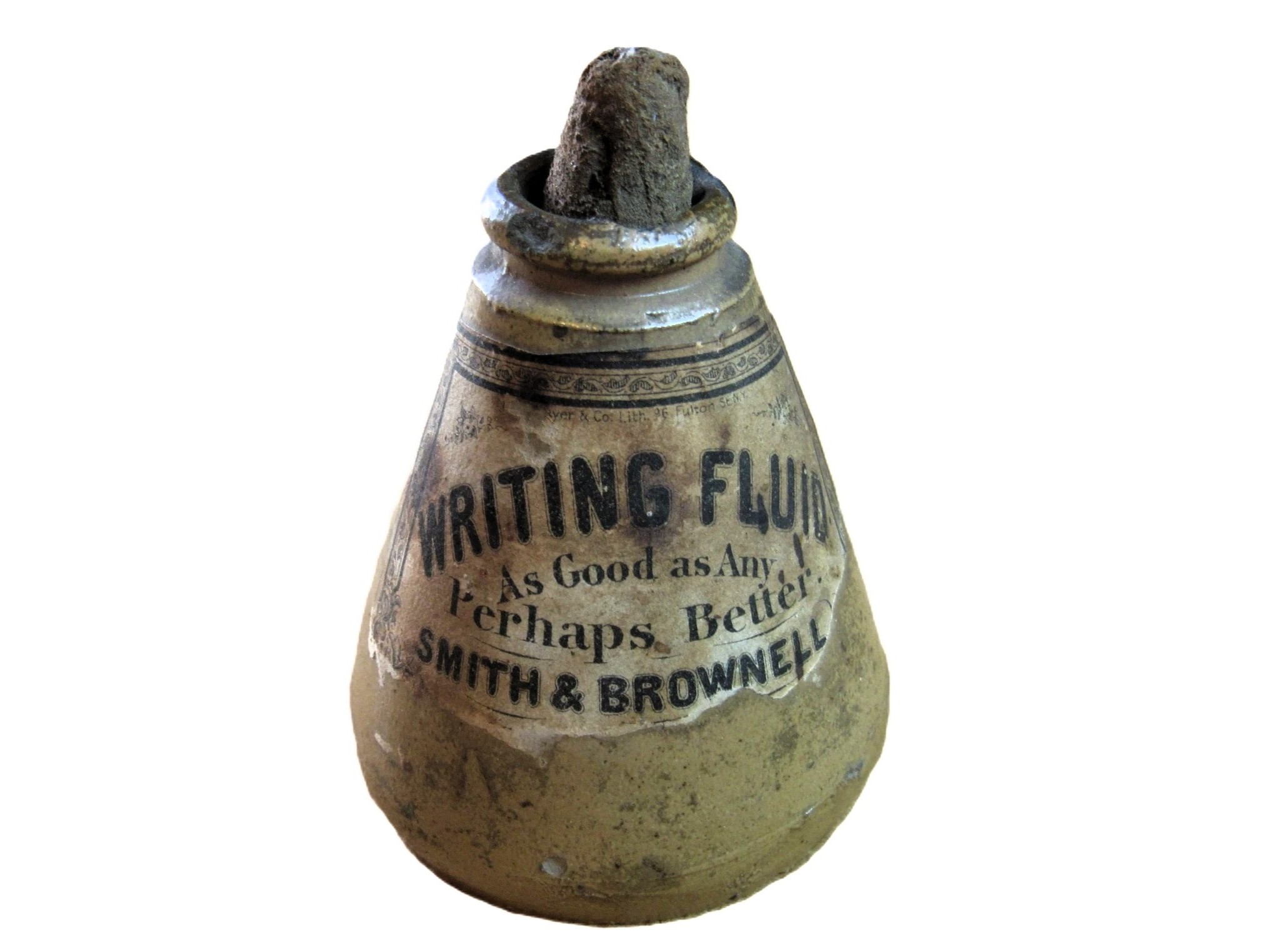
This ink bottle is a survivor. Finding a common 19th-century stoneware “cone” ink with its original paper label intact is rare, as these were utilitarian items meant to be discarded once the ink was gone.
Dating the Bottle
Ferdinand Mayer Lithograph Company:
- Location: Ferdinand Mayer established himself at 96 Fulton St., New York in 1855. He eventually expanded into the neighboring property (98 Fulton St.) a few years later.
- Company Name: The label identifies the lithographer as “Mayer & Co.” Ferdinand Mayer operated under this style before his sons joined the business. Around 1870, the firm was renamed Ferdinand Mayer & Sons (sometimes seen as “Ferd. Mayer & Sons”).
- Timeframe: Because the label uses the “Mayer & Co.” name and the single 96 Fulton address, the 1855–1865 window is the most historically accurate range for this specific bottle.
Additional Context on Smith & Brownell
While “Smith & Brownell” are not as widely known today as giants like Stephens’ or Arnold’s, they were typical of the mid-19th century New York stationers or “chemists” who produced their own “proprietary” writing fluids.
The tagline “As Good as Any, Perhaps Better” is a charming example of the competitive, slightly defensive marketing of the era. Writing fluid (unlike traditional thick iron-gall ink) was a thinner, more free-flowing product designed for the steel pens that were rapidly replacing quills during the 1850s.
Description
- Form: A classic cone-shaped (or “ring-cone”) stoneware bottle. This shape was intentionally designed with a low center of gravity to prevent tipping on a desk.
- Material: Salt-glazed stoneware. The “orange peel” texture is a result of throwing salt into the kiln during the firing process, which creates a durable, vitreous finish.
- Label: A remarkably well-preserved lithographed paper label. The ornate border and “Writing Fluid” typography are characteristic of the Mid-Century graphic style.
- Stopper: It retains a cork remnant. These bottles were typically sealed with a simple cork and then dipped in wax or pitch for transport.
Note
Stoneware inks were often produced in massive quantities by potteries like J. Bourne & Son (Denby) or those in the Fulham district of London and exported to the U.S. empty. They were then labeled and filled by local American firms like Smith & Brownell. Without this label, this would be a “common” $20 bottle; with this specific, localized New York label, its historical value is significantly higher.
Sold for $138 in January 2026
Content disclaimer. The information posted is the owner’s best knowledge and may not have been vetted by the SOIC. We welcome comments, corrections, and additions, working to make our website information comprehensive and accurate.
Join the Society of Inkwell Collectors (SOIC) – it’s free!
Founded in 1981 as a non-profit organization,
we are documenting inkwells (and accessories).
We’re here to help and inform!