

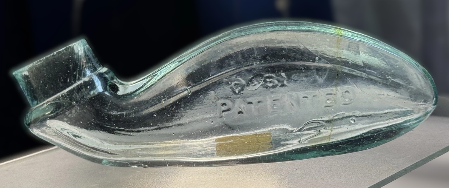
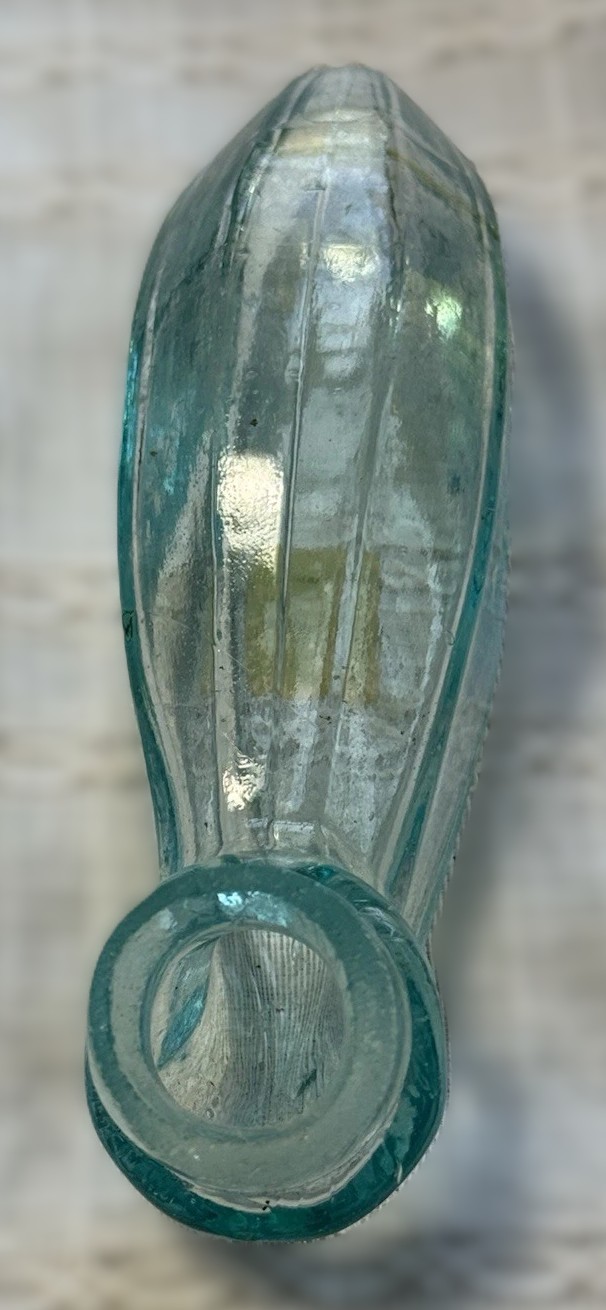


The “Whale” Ink Bottle
| Categories | Ink Bottle |
| Material | Glass |
| Markings | See narrative |
| Manufacturer | Undetermined |
| Origin | United States |
| Date or Era | circa 1876 |
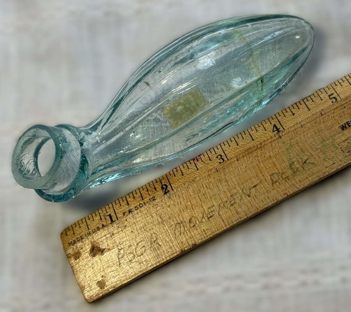
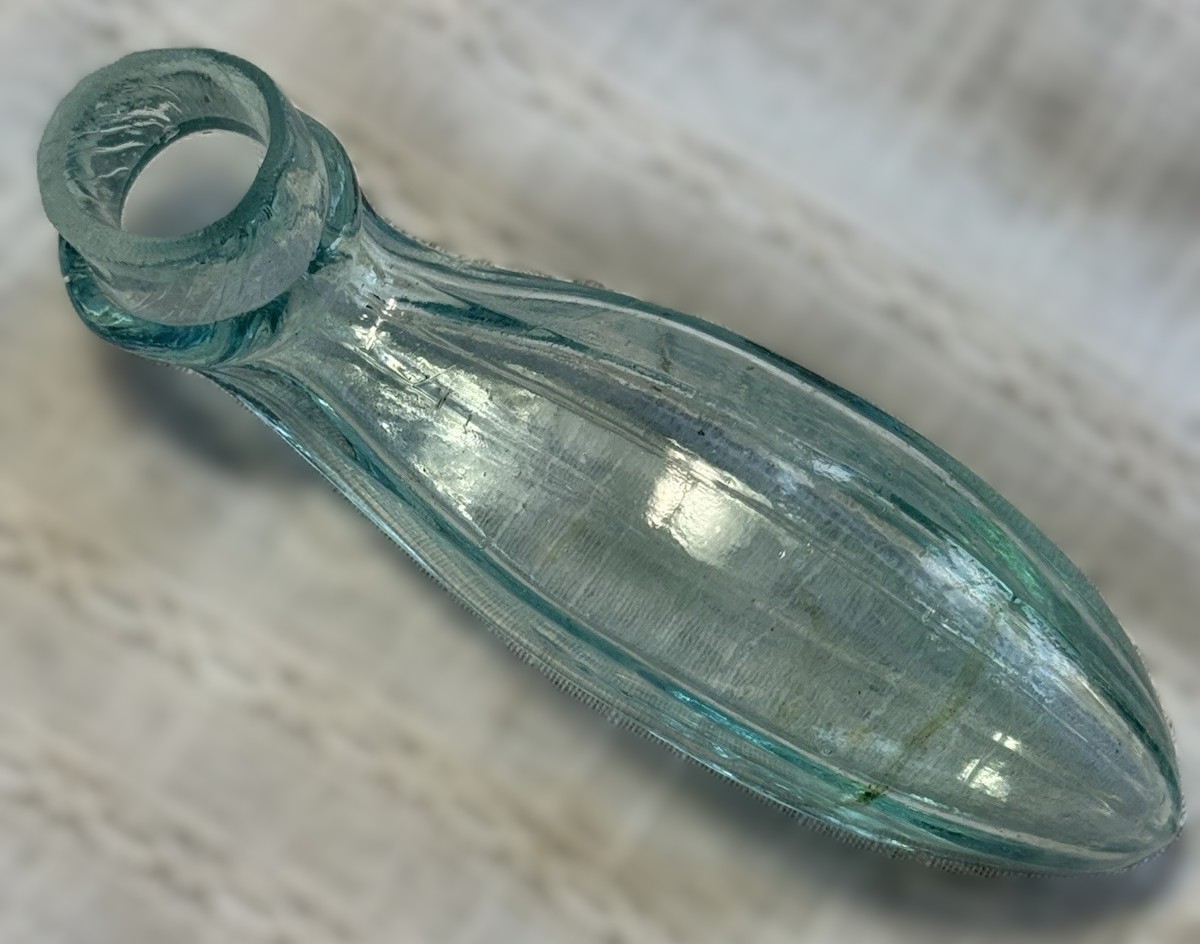
| Measuring | 5 ¼” long, 1 ⅝” high (at the hump) |
Date: 1876 (Centennial Era) Form: Figural “Lie-down” or “Self-Righting” Ink Glasshouse: Likely American (New England or Midwest region), maker unknown.
- Physical Description
This is an example of post-Civil War utilitarian glass.
- Color: It is blown in a light aqua (aquamarine) glass, the most common color for utility bottles of the 1870s, resulting from natural iron oxides in the sand that were not neutralized by clearers like manganese.
- Manufacturing Method: The bottle is mold-blown. You can observe the faint mold seams running along the sides of the body, which fade out as they reach the neck.
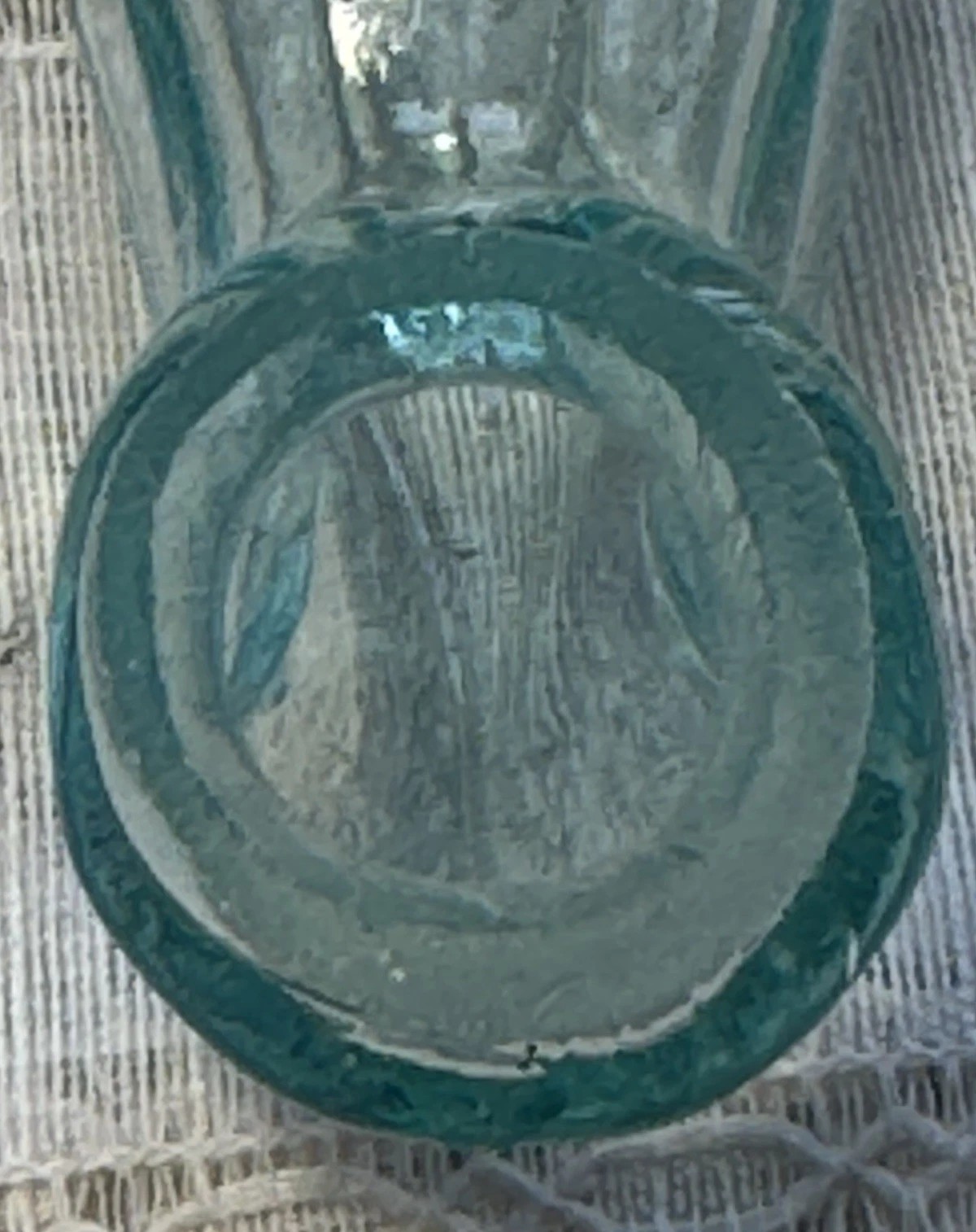
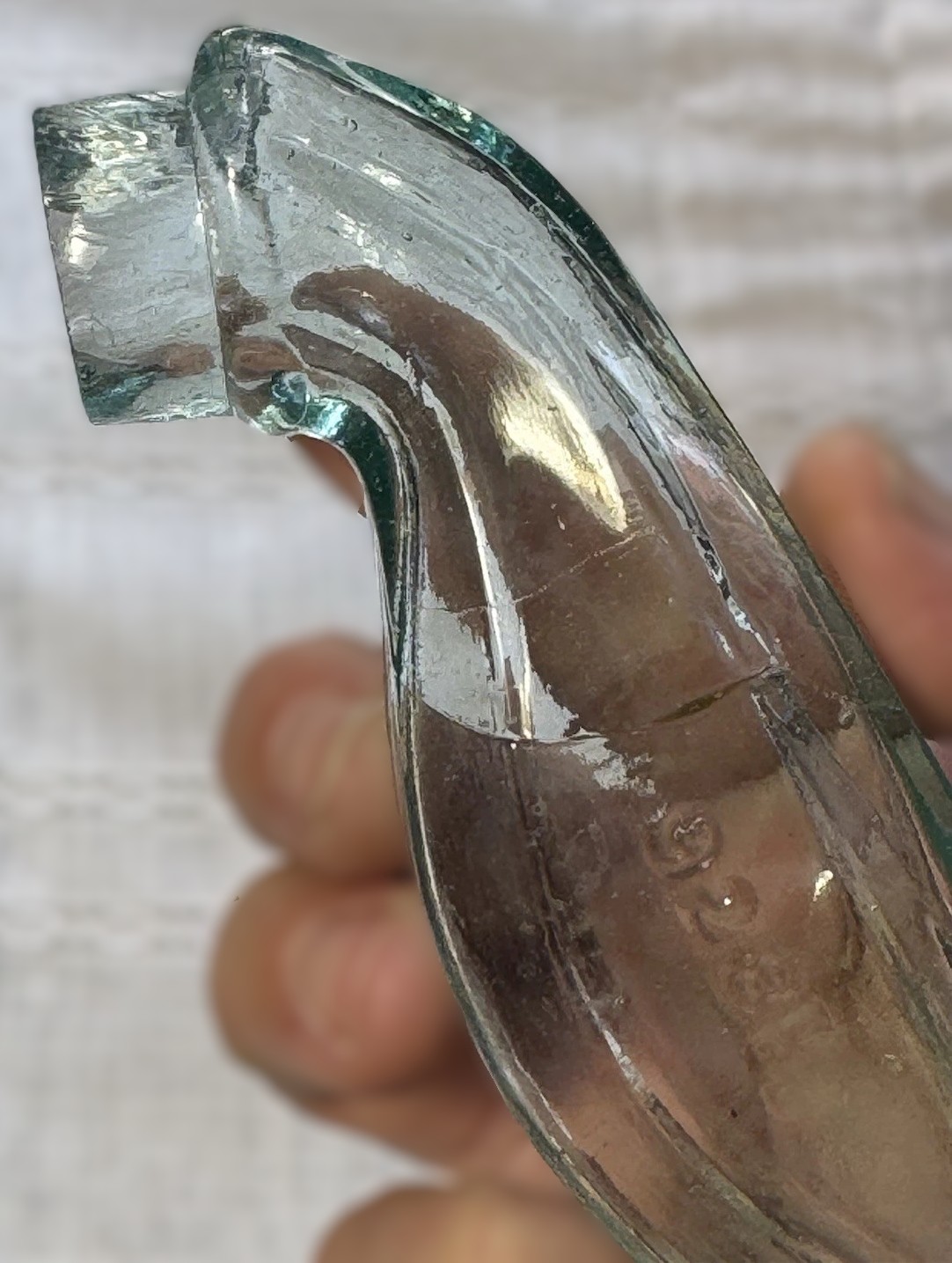
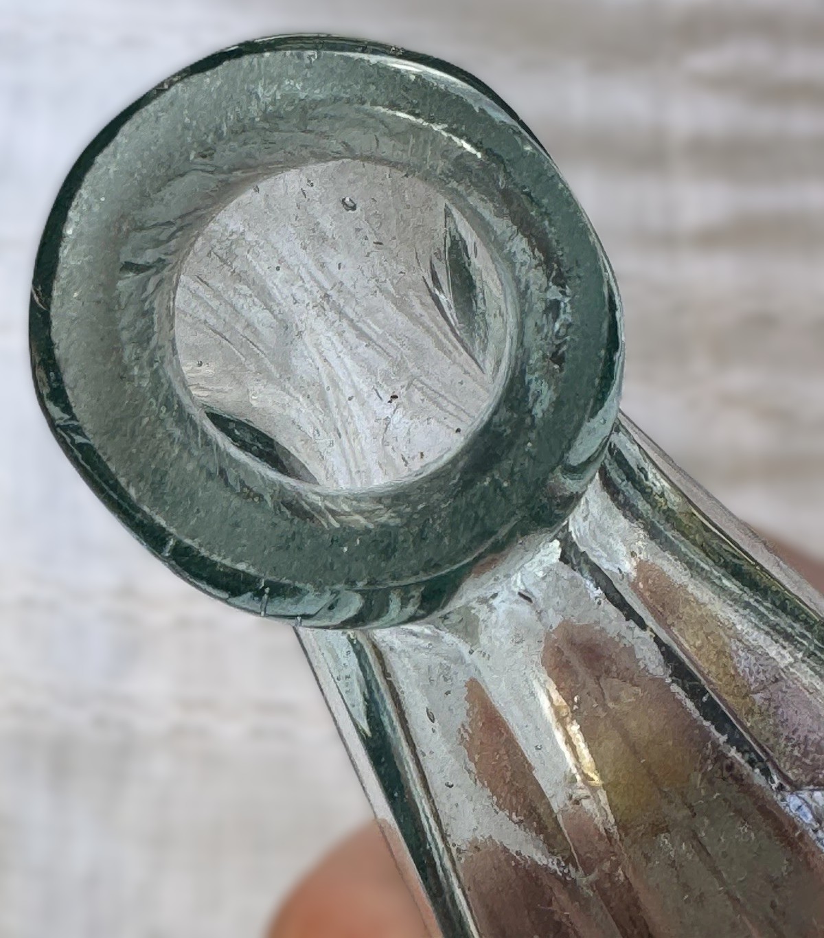
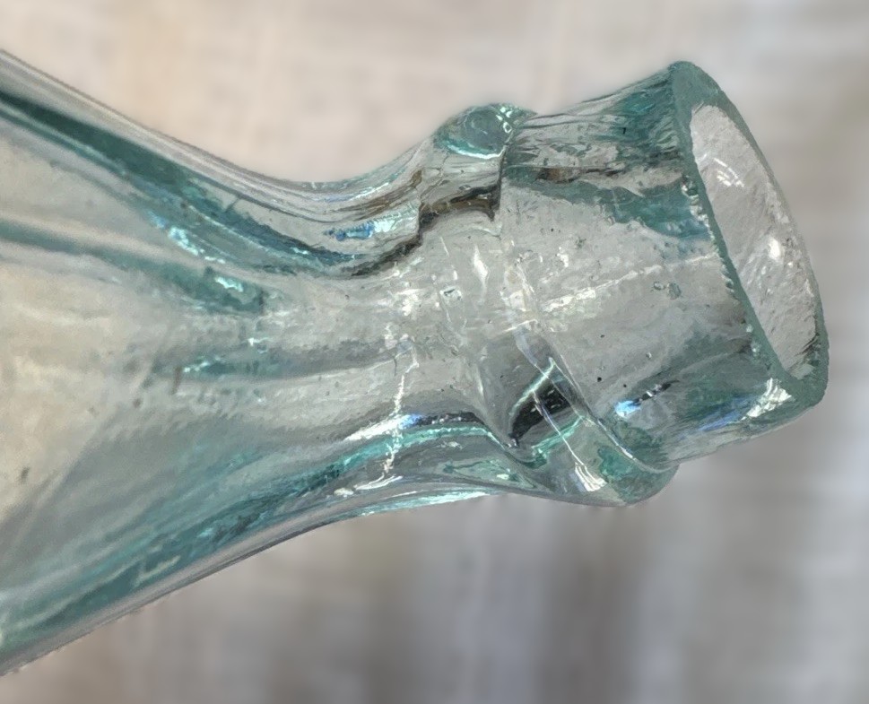
- Finish (Lip): The mouth features a crude, applied lip. This indicates that after the bottle was blown into the mold, the glassblower used a tool to hand-finish the opening, rolling a ring of hot glass onto the neck to create a sturdy rim for a cork.
- Texture: The glass exhibits “whittle” marks (a wavy, hammered texture) and seeded bubbles. This “whittling” occurred when hot glass was blown into a relatively cool metal mold, a hallmark of 19th-century production.
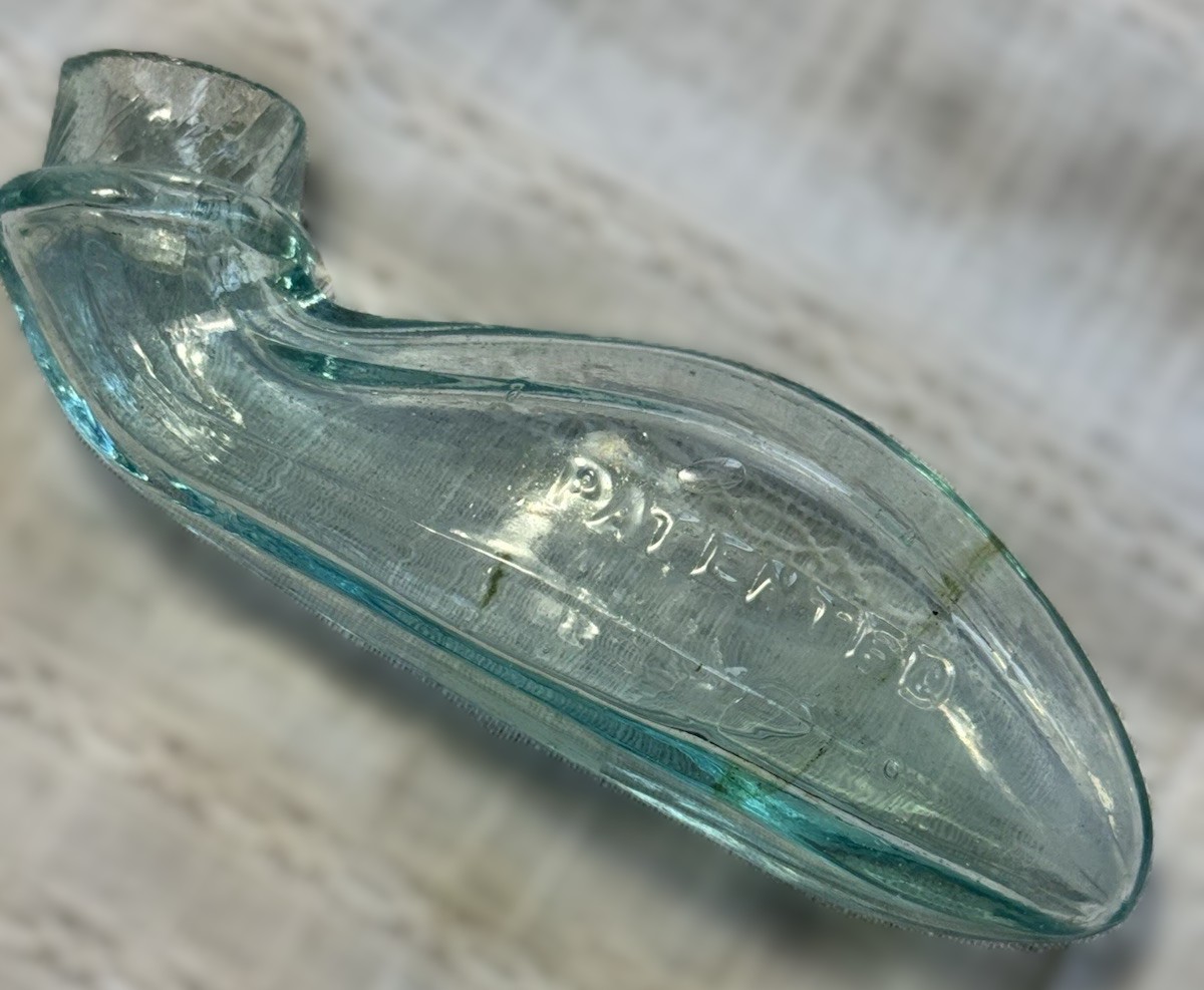
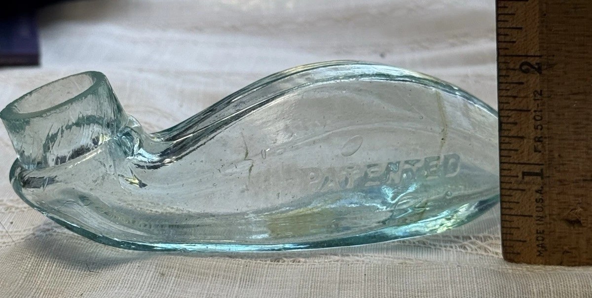
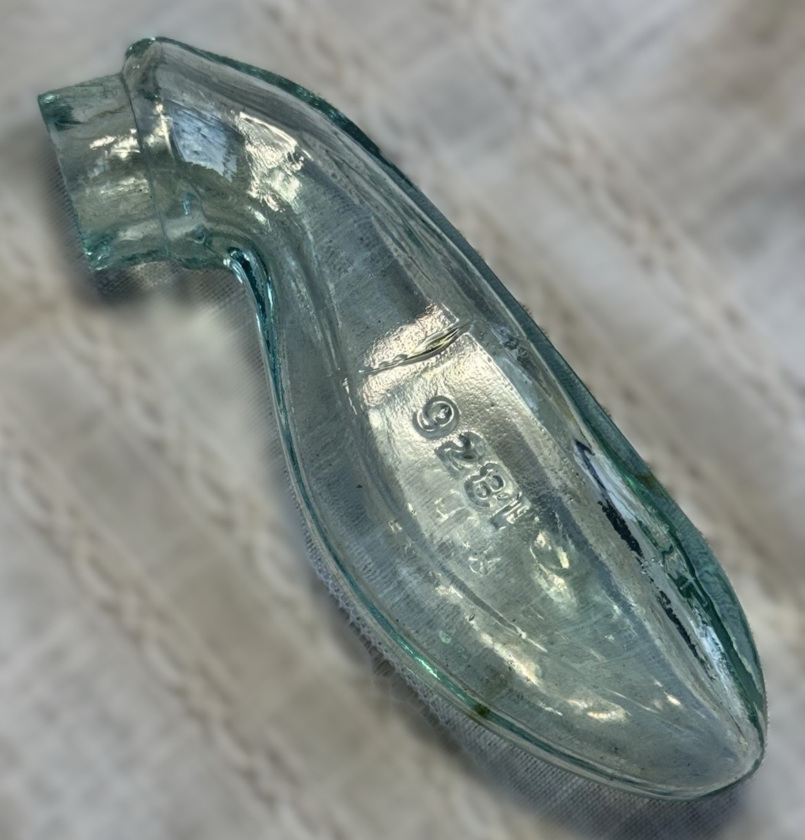
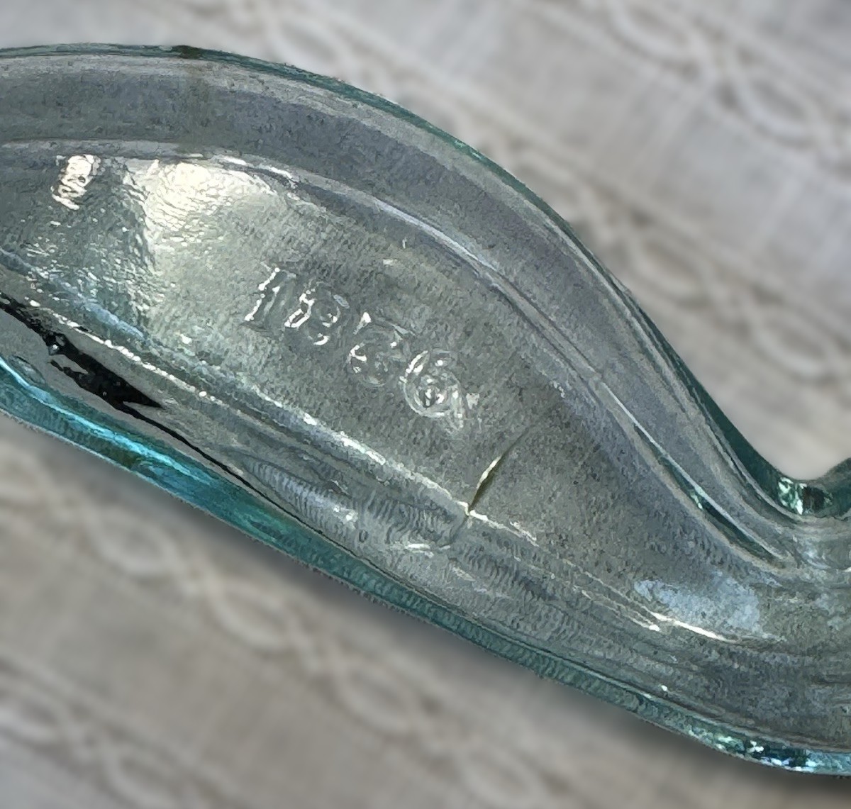
- Embossing: The side is crisply embossed with “PATENTED” and the date “1876,” celebrating the year of its design protection.
- The Design Mechanics
Although the specific patent number has been elusive, the design narrative associated with Edward W. Nourse’s “Improvement in Inkstands” (May 30, 1876) perfectly explains the engineering behind this bottle.
- The “Bulbous” Body: The patent describes the main reservoir as having a “bulbous form.” This shape was not just aesthetic; it kept the center of gravity low.
- The “Counter-Balancing” Tail: The elongated rear section (the “tail” of the whale) was designed to be “solid or thick” to act as a counterweight.
- Self-Righting Function: This is the genius of the piece. As described in the patent text:
“When the pen is dipped into the neck… the force applied tends to tip the bottle forward… but the moment the pressure is removed, the gravity of the heavy tail instantly draws the bottle back to its original position.”
- “Locomotive” Safety: The patent suggests this design was intended for use on “railroad-cars” and ships. The low profile and heavy tail prevented the ink from spilling despite the vibrations and jolts of 1870s steam travel.
- Collector’s Analysis
- Rarity: While “Whale” inks appear on the market, they are prone to damage. The long, tapered tail was a structural weak point and often snapped off. Finding one with the tail intact and the lip free of major chips is uncommon.
- The “Lie-Down” Category: Collectors classify this as a “Lie-down” ink because it could be corked and carried in a pocket or luggage without tipping, unlike square “desktop” inkwells which were prone to leaking during travel.
Antique Glass Ink Wells and Master Inks
This video from the Heritage Glass Museum provides excellent context on antique ink bottles, including discussion on “master inks” and the variety of shapes used in the 19th century.
Sold for $120 in November 2025
Content disclaimer. The information posted is the owner’s best knowledge and may not have been vetted by the SOIC. We welcome comments, corrections, and additions, working to make our website information comprehensive and accurate.
Join the Society of Inkwell Collectors (SOIC) – it’s free!
Founded in 1981 as a non-profit organization,
we are documenting inkwells (and accessories).
We’re here to help and inform!